
10 E-commerce Website Basics
In 2019, there are 1.92 billion online shoppers, and by 2021, that number is expected to reach 2.14 billion. That’s a lot of potential customers. Whether you’ve been running your e-commerce website for years or are just breaking into the online market, you’ll want your website as user-friendly as possible. Some of these basic needs will help your clients navigate from home to check out, while others are eye-catching components that will make your brand seem modern and reactive. Stay up to date with these growing e-commerce tips.
What is E-commerce?
If e-commerce sounds like a complicated, high-tech term, don’t worry. I promise that you’ve used an e-commerce website more than once in your life. Ever heard of Amazon? Amazon is the epitome of online businesses. Anytime something is sold or bought online, that’s e-commerce.
Some businesses are entirely e-commerce based, while others may have a physical store with an online component to reach a wider audience. An e-commerce site can also help customers who have stopped in-store to buy additional pieces from the convenience home. Or, they can show the variety of your merchandise to their friends. Customers of all ages appreciate an accessible website to browse and shop. And as Generation Z grows older, e-commerce is only going to become more and more vital to businesses.
Anything that can be easily shipped, like home-goods, clothing, toys, and phone products, are popularly sold via online websites. There’s even an increasingly popular market for selling complete meals over the Internet, like Blue Apron and Freshly. To reach more customers with as little overhead as possible, start creating your e-commerce website today.
10 E-commerce Website Must-Haves
Entering the online market can be overwhelming for its tendency toward fast-paced change. Every year, there are new trends to worry about. However, there are basics that remain the same for years at a time. For e-commerce, it’s all about making it easy for the customer to find what they want and check out before they change their mind.
E-commerce follows the same #1 rule as any other website: convenience, convenience, convenience. If it takes your customer more than .1 seconds to find the shopping cart, they’re likely to give up and go to a competitor with a more navigatable site. Important components to your site need to be visible and obvious. Here are some basic UX/UI design must-haves for your e-commerce website:
1. Navigation
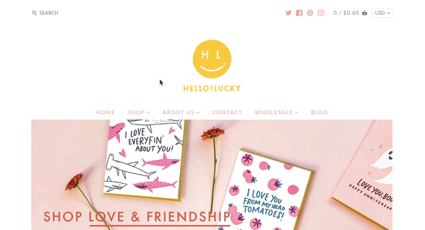
When customers are using a website, they shouldn’t feel like they’re on a treasure hunt. Make things like home, about, contact, and categories for your merchandise obvious as the top of the page. Drop down menus should consist of related groups. For instance, “belts” could go under “accessories.” Things like contact, checkout, and add to cart buttons need to be visible and organized. Most e-commerce sites also have a “view shopping cart” icon in the top right corner. This is the universal place where digital buyers will look when ready to check out.
With that said, DON’T make your navigation bar visible during checkout. This may seem counter-intuitive, but when customers are checking out, you want them to be focused on finishing up and buying that product. If they are able to see the navigation menu, your customers may become distracted by other options and end up window shopping for hours. You could suggest related items post-checkout, but definitely not during the process.
2. Guest Checkout
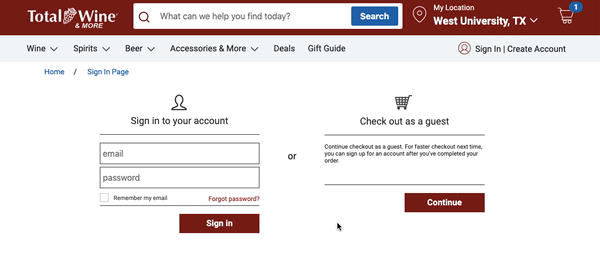
After all the work you’ve gone through to bring traffic to your site, you don’t want your customers to lose momentum because they have to fill out lengthy membership forms to make purchases. Anyone who ever made an impulse-buy knows how quickly the urge to spend money can dissolve, so make the process as quick as possible with guest checkout.
Of course, membership is great for customer retention. But if you want to feature a 25% off coupon for members on your homepage, continue to offer guest checkout for those who think they only want to shop with you once. Then, offer membership after a customer has completed their purchase with an incentive. This might include membership saving the customer’s payment method or automatically emailing them a certain promo-code good for up to 30-days after they sign up. Also, make sure to keep those sign-up forms as short as possible by only asking for necessary information.
3. Shipping Details
 Ambiguous shipping details are a big deterrent for prospective customers. Imagine going through the process of finding that perfect coffee table only to find out after entering all of your credit card information that the shipping costs will put you way over budget. In addition, your customers need to know how long it will be before they see their impulse-buy in person. Offer multiple choices for shipping at varying costs to fit every customer’s budget (and patience).
Usually, the best place to place shipping time and costs are on the shopping cart page. Otherwise, shoppers may lose patience if they have to wait to find out the total costs after entering all of their personal information during the checkout process.
The exception here is offers, like how much a customer has to buy in order to get free shipping. These should go somewhere between the product’s price and the “add to cart” button. All of these technical details will keep the process smooth and pragmatic for customers.
4. Return Policies
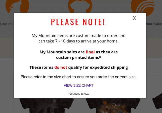
While you hope customers won’t want to return goods, informing shoppers of your return policy early is key to establishing trust. Most of the time you can insert the return policy somewhere around the shipping details during checkout. This should include information about a time frame, refund amount, and damages allowance. All of these details legitimize you as an honest business owner who cares about helping your customers make informed decisions.
A special case is if you have a no returns policy. This is common for hand-made or personalized goods, but the customer might not know that. If you have a no returns policy, make that known in the product description and reiterate before they hit the “confirm” button during check-out. This will save you the headache of angry phone calls and poor customer reviews from those who didn’t see that one blurb on your home page about your no returns policy.
5. Secure Checkout (SSL)

E-commerce has become insanely popular, but some people worry about their credit card or personal information getting leaked via online shopping. Secure checkout is not only a necessary detail for security’s sake, but also for trust.
Whether you’re using Chrome or Safari right now, take a moment to look up at the address bar. To the left fo the URL, you should see a lock icon. This means that if you enter personal information anywhere on our site, like your e-mail or phone number, it will remain private. This is such a major element of today’s website culture that if a website doesn’t have security, it will be noted in clear view in the address bar or in a pop-up window.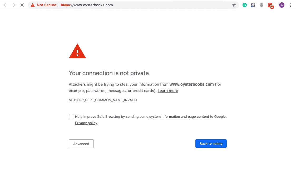
Popular e-commerce hosting websites come ready with a security certificate, or SSL, on every page. If your website currently lacks that lock icon, immediately make a call to your hosting service (whether it be Shopify, GoDaddy, Wix, etc.). A warning about an insecure website will undoubtedly deter most digital buyers from using your site!
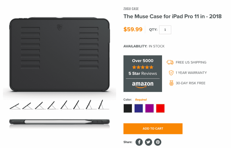
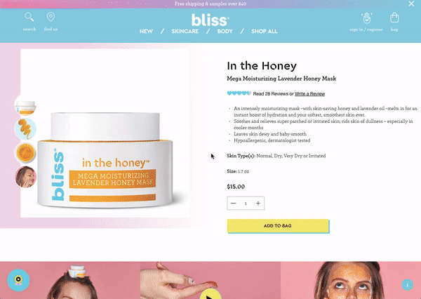
6. Product Photos
 While you likely already know that you should feature images of your products on your website, be open to providing a variety of types of images. This means not only offering the product with a white background but also utilizing lifestyle images.
Lifestyle images show your leggings being worn by a model practicing yoga outdoors or your furniture arrayed in an IKEA fashion. These in-context photos help your customers really see how your product could fit into their lives. Some websites opt to use only white background photos on product pages with lifestyle images reserved for the larger hero images at the tops of pages. Others feature a white-background photo with just the product, but a slideshow on the product page of lifestyle photo and white-background photos of other angles and colors.
My personal favorite is a white-background or lifestyle photo that changes when you scroll over the image it with your mouse. St. Frank uses this tactic to show off their home-goods merchandise. This provides the most information with the least amount of effort. When deciding which method to us, keep in mind who uses your products and if they need to see other angles or how the product is practically used. For small businesses, it’s easy to generate your own photos with free photo editing apps.
7. Checkout Process
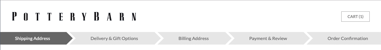 After filling their cart with goodies, your customers are eager to finish the buying process. You can make the checkout process feel less tedious by adding a bar marking their progress. This bar will have steps like shipping address, shipping options, payment method, and order review. This process can feel tedious to guests, but being able to see their progress will make the process more “instant gratification” inducing. Some websites use a step-by-step bar or tabs to measure the checkout process.
8. Advanced Payment Methods
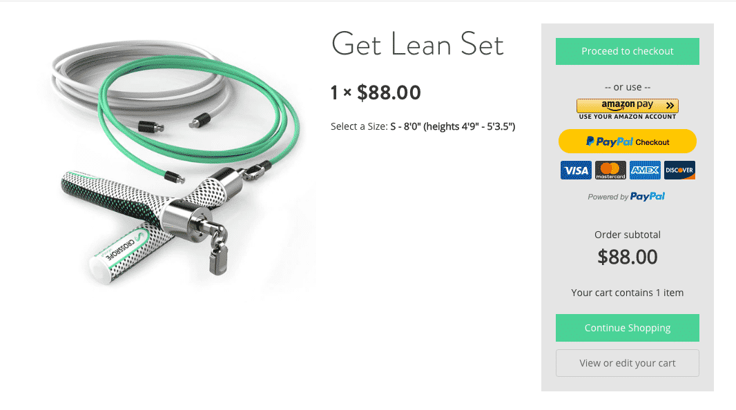 To make checking out as easy as possible, customers need a variety of option to pay for your products. Depending on your e-commerce website host, you may be able to offer MasterCard, American Express, Visa, Pay Pal, electronic transfer, or gift cards as methods of payment. You should feature the logo for each of these methods at the bottom of your e-commerce pages to show that you are open to accepting payment in whatever way the customer is most comfortable with.
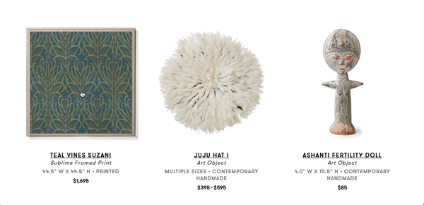
9. Similar Products
A similar products section is how you pull customers into endless time exploring your merchandise until they find the perfect match for their taste and needs. On each product page, somewhere under the photo, pricing, and description should be an area with images of suggested products. These could be either products with a similar use, but different colors, patterns, or styles. This will help customers find something that fits their taste better than what they’re currently hesitating to buy. This section could also feature complimentary merchandise, like a throw pillow and blanket to go with that comforter they just added to their cart. Similar products are free advertising for the rest of your merchandise built right into the product page.
10. Customer Reviews
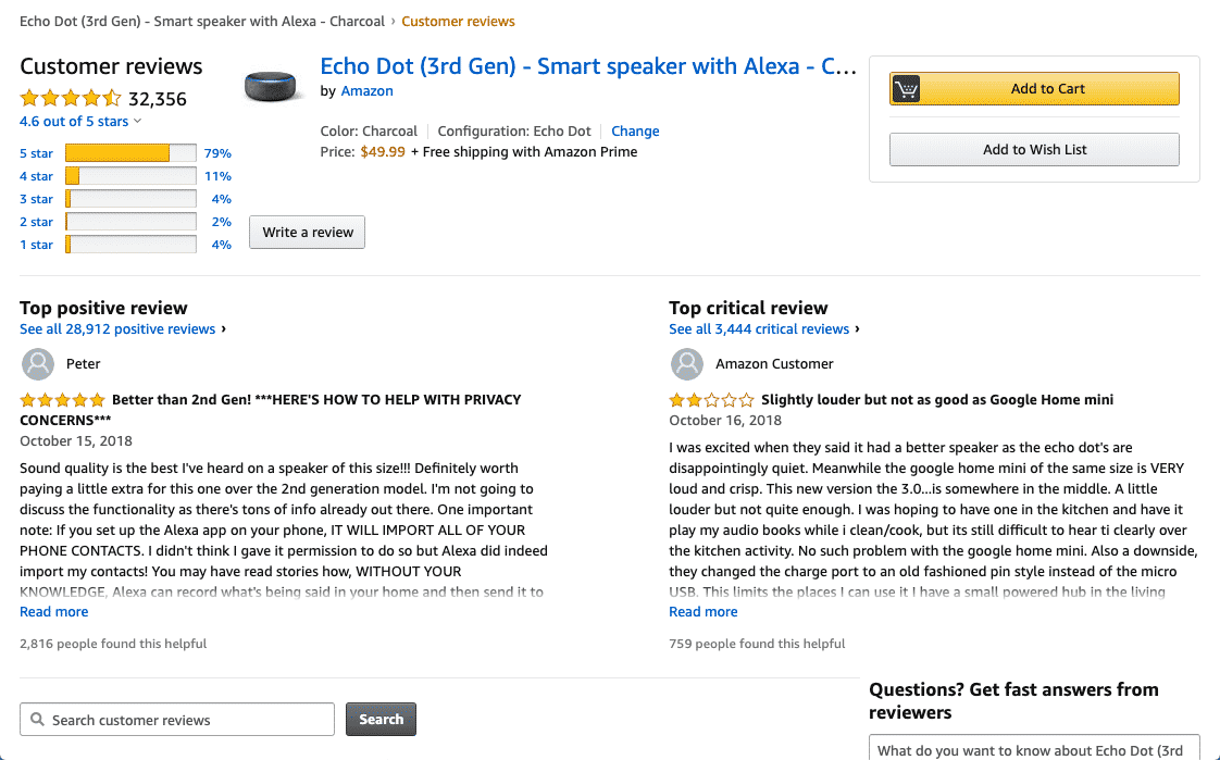 There is no better way to gauge a quality business than with other customers’ reviews (e.g. Yelp). Allow customers to give feedback on the product pages for future customers to see. Star-ratings and comment sections are popular measurements for customer reviews.
Of course, you do need to monitor reviews for any negative feedback. In this case, respond to the upset buyer. Offer to get in touch with them to address an issue and reaffirm your dedication to your customers’ satisfaction. This will show maturity and trustworthiness to future potential buyers.
Also, social media can be a great source for customer reviews. Encourage customers to tag your social media accounts on Instagram and Twitter with feedback. Even a “Look at my new (insert product here)!” picture on Instagram is free publicity for your business.
We know that these details can feel overwhelming. If we’ve sparked your inspiration to upgrade your website, but you’re not sure how to implement these must-haves, book a 30-minute free consultation with us today!