Every website designer, business owner, and anyone who has ever used the internet can tell you the benefits of UX/UI Design, or user experience and interface design. User experience is the feeling a person has after using a product, system, or service.
For instance, McDonald’s wants you to feel hungry for Big Macs. Apple wants you to feel like they’ll make you an innovator. Both companies make their websites accessible and streamlined. You don’t feel overwhelmed or frustrated, so you also feel that you can trust these companies with your time and money. User interface refers to this same concept, but specifically for websites, apps, and software.
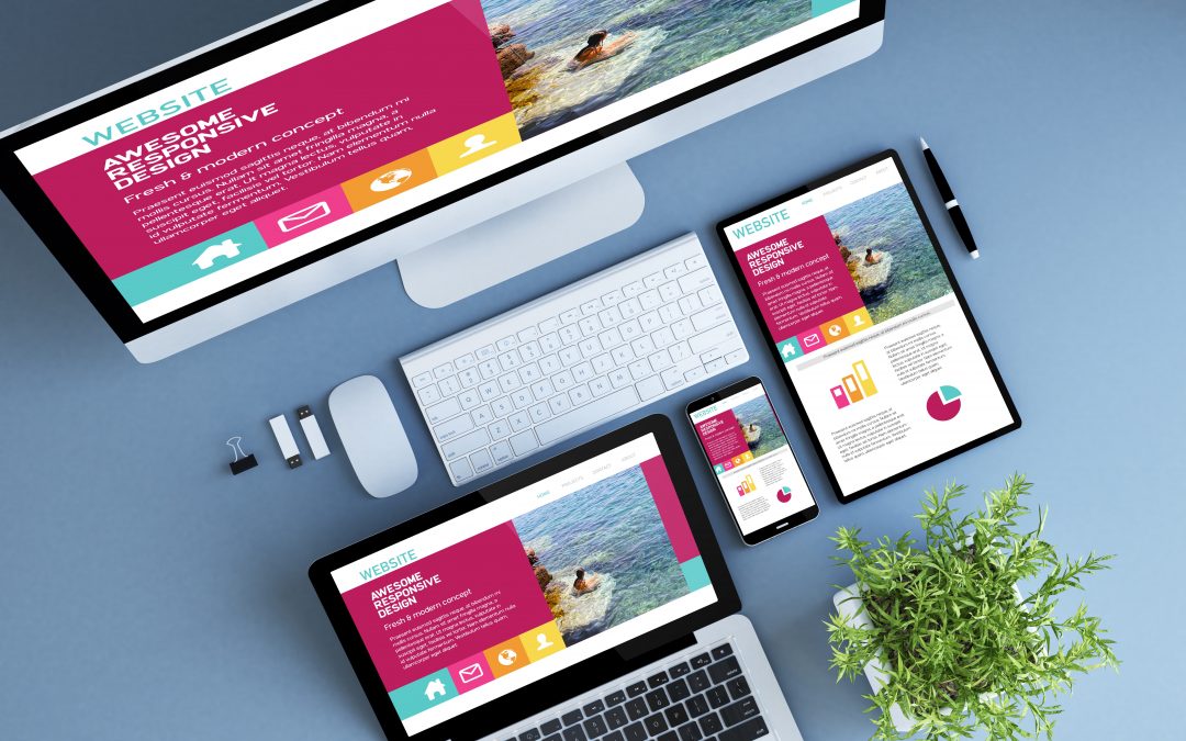
This website design sums up many of the tips below to launch your website to success in 2019.
The better the experience, the more likely people are to stay on your website longer, read the copy you slaved over to portray your mission, and ultimately use the product or service you’re trying to sell. Good UI builds trust with the company and makes you look capable in your field. Nowadays, poor UI can delegitimize your whole website. This year, companies are emphasizing UX writers, visual storytelling, and interactive content to attract more customers. Here are UX/UI design trends that you should seriously consider in upgrading your website for your audience.
UX Writers
1. Quality Copy
Whether boosting your SEO with a blog or updating your home page, every word you put down could either convince clients to use your services or steer clear of your logo. When thinking of UX, most people consider imagery, but copy stands out more than you think. If you want people to get to know you and trust you, then they need to be able to comfortably understand your mission and learn why your business stands out from the competition. This not only means having good grammar but also creating attention-grabbing, thought-provoking sentences that tell your story.
2. Oversized Headlines
Now that you know every word counts, catching your audience’s attention is your #1 priority. This can often be done with oversized font for your headlines. Usually, the simpler the font style, the better. Fancy script looks great on wedding invitations and the Declaration of Independence, but if reading your headline takes an extra millisecond, you’ve already lost most viewers. Our attention spans are growing shorter and shorter so think BIG, clear font with plenty of negative space around it. Also, the fewer colors the better. White or black letters aren’t boring, but practical. This works for all headings: pages, blogs, and Instagram posts alike.
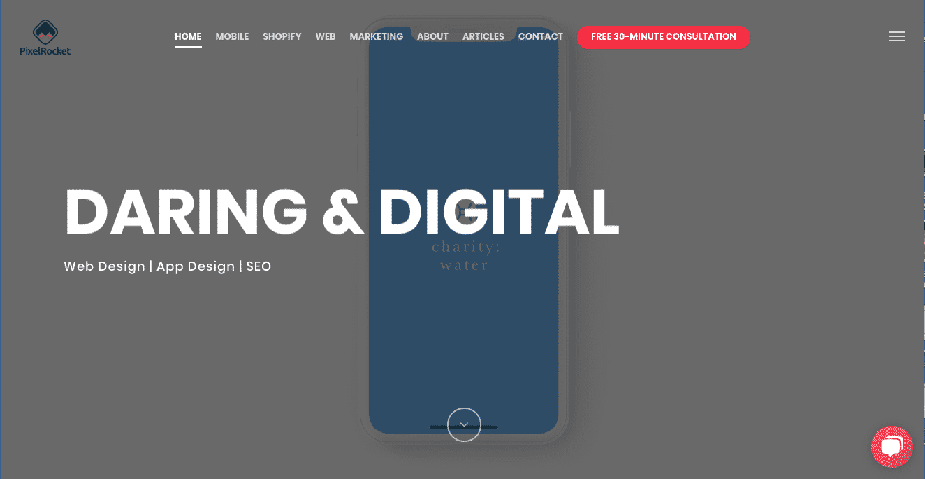
Our homepage following this tip with our mission in full view.
Visual Storytelling
3. Original Illustrations
Images are powerful tools for storytelling, branding, and uniqueness. Your website may be the first interaction a lot of people have with your business, so you don’t want dull stock photos or grainy clip art anywhere near your home page—or any page, for that matter. We know, we too love free online images. But if you’re business can afford a designer for some original illustrations, create original material for customers to remember you by. Even if you’re a start-up, find a talented friend with a drawing tablet to create a unique banner for your home page. Don’t be afraid to get quirky and creative with these. Like your logo, illustrations should reflect your company’s core values and convey your mission with just a glance.
4. Geometric Shapes and Bright Colors
To compliment your large, bold headlines, graphics should be structured and loud. With a palette of 3-4 colors, you can create a lot more than you think. These designs can be a few squares or an intricate scene with bold colors and black lines. The same rules apply for photography. In any case, your imagery needs to be comprehensible to the majority of your viewers clicking through your site or scrolling at the speed of light. The simpler you make these shapes and the colors, the more complex you can afford to make those images to include more information without overwhelming your audience.
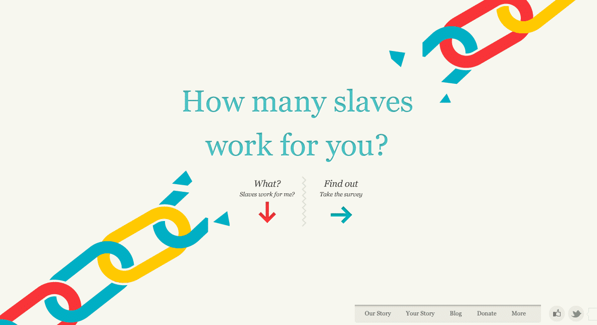
Slavery Footprint uses a simple illustration to deliver a startling message.
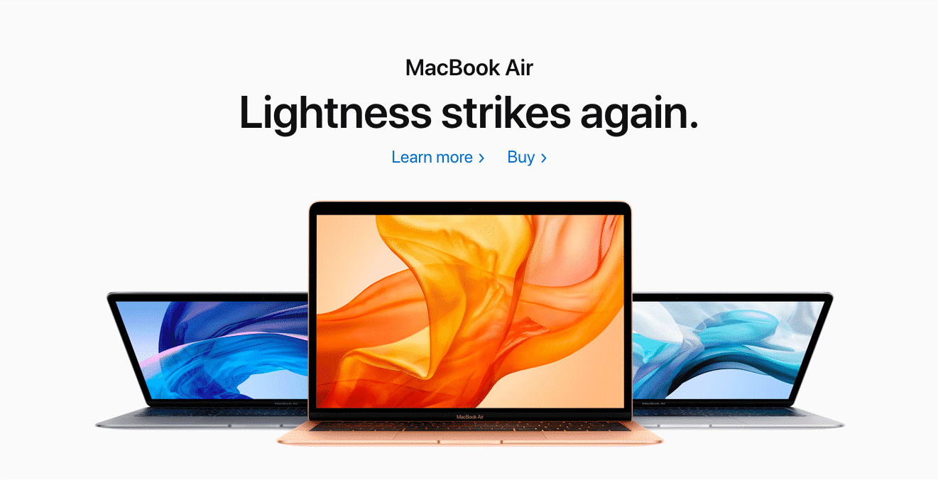
Apple uses this tactic of few colors, geometric shapes, and large, limited text to achieve a minimalistic, but creative look.
5. Animation
Using the above tips of less-is-more, animation will catch anyone’s attention. Remember the iconic Windows screensavers that you could watch for hours? Nowadays, animations should be more fluid, but you want to go for that same mesmerizing effect. Don’t go too crazy with this, either, as you don’t want to distract viewers from the rest of the site.
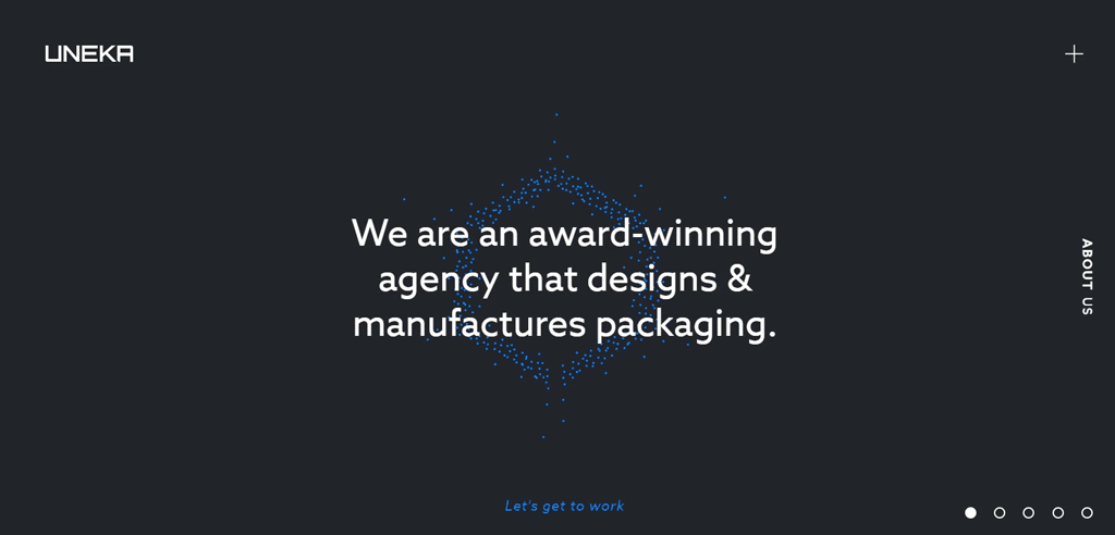
Uneka Concepts, a dynamic design and manufacturing firm, uses animation on their homepage to show off their innovative packaging.
If you want to use a longer animation, isolate it to the top of the page so as not to distract from the text below. our own homepage features an animation of our partner charity: water (behind the aforementioned bold, white text). If it’s too long, consider a video with a play and pause button that can be inserted anywhere on the page (more on videos below). Even if it’s just a small part of your logo flickering into existence, the cool effect is there. Some themes will also allow images to fade into existence or banners to slide into place as viewers scroll downward. We’ve even started outfitting our blog with gifs as preview images. These small animations will make your website more alive and unique.
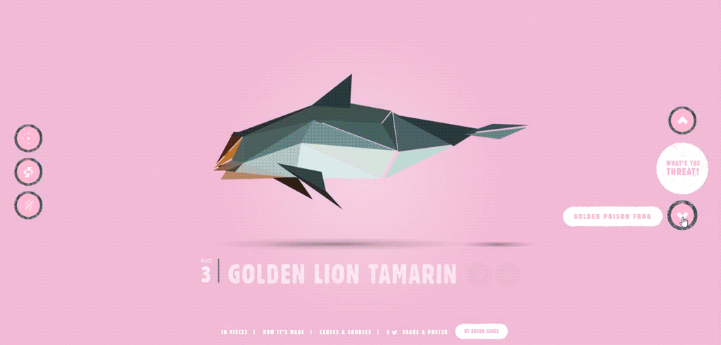
In an extensive degree of animation, Species in Pieces cleverly transitions between artistically rendered endangered animals to promote species preservation.
Interactive Content
6. Personalizing Interactions
Engaging your audience ensures they stay on your page for longer amounts of time, increasing the chances that you’ll convince them to inquire further and use your services. Personalizing a user’s experience makes the site or app more specific to their interests. For instance, a clothing store may ask what size, colors, and style someone likes before bringing them to a page specific to their interests. Most other businesses can follow a similar pattern: ask a few standard questions to bring viewers to the most fitting solution. This method is interactive, engaging, and makes customers feel like you’re catering to their wants and needs.
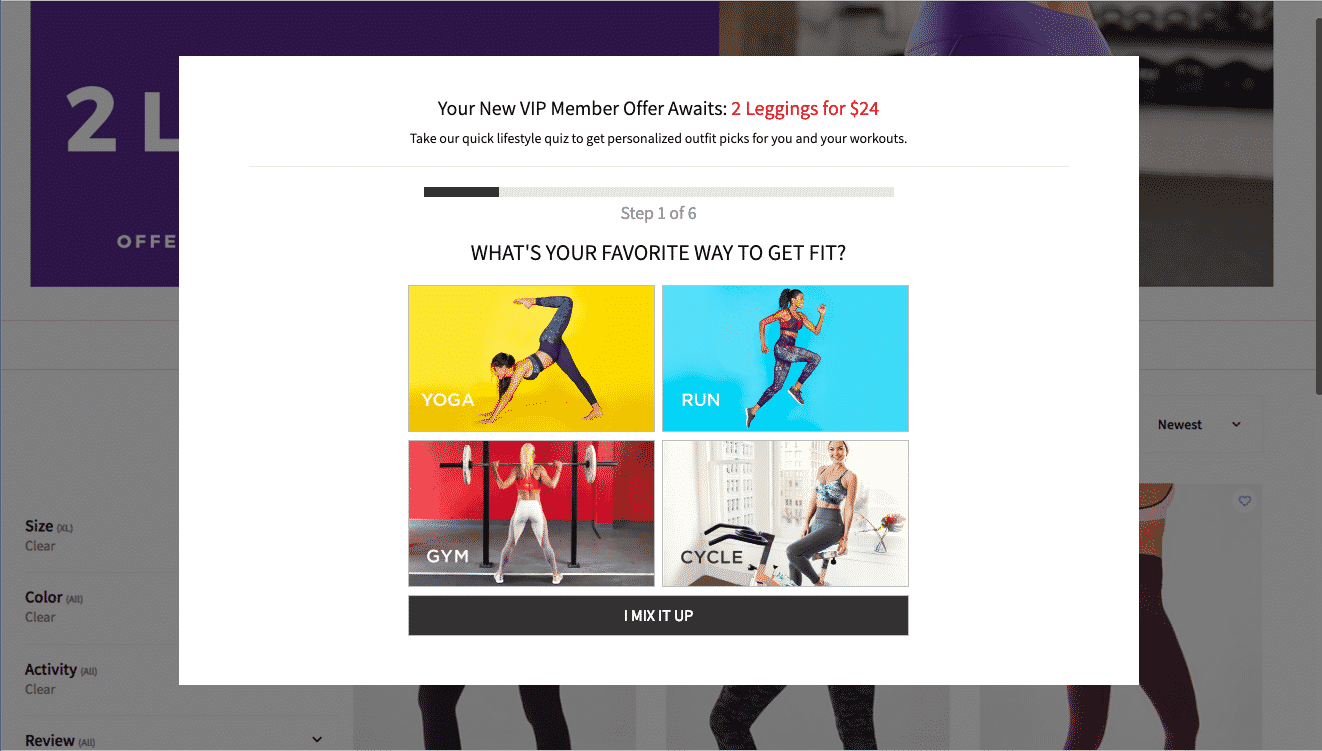
Fabletics uses a series of questions to help potential customers find the right leggings for them.
7. Video Content
Video content is another route to keeping viewers’ attention. Since Google’s algorithm measures how long people stay on your pages, a short video or two can buffer this statistic. These videos could be cool graphics following the same tips on visual storytelling. You could also use this opportunity to introduce your founder or present raving testimonials from real clients.
Like every other subject mentioned, these videos need to fit our short attention spans. Nothing longer than 5 minutes should be on your homepage. Of course, if you want to provide tutorials on how to use your incredible services, redirect traffic to a page specifically for videos. Find a theme that allows autoplay or suggestions for next videos to keep viewers stuck in the same loop that Youtube uses to keep you watching Vine compilations for hours at a time.
8. Buttonless Features
10 years ago, iPhone discovered that we hate buttons. Typing on tiny keys was too much work for the average consumer, so they got rid of physical buttons. Now, it’s time together rid of virtual buttons as well. Being able to swipe left or right has proven to be addicting. Endless scrolling? Your favorite social media platform is already using this to keep you trapped all day. These features are easy and keep your webpage or app free of clutter. Not only are these features sleek and smooth, but the engagement value is priceless.
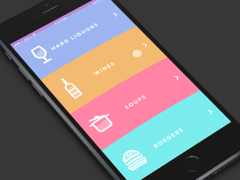
This menu app allows you to easily navigate with scrolling. Notice the added affect of the animated icons and simple colors.
UX/UI Design
You might have noticed that all of these new changes are about keeping your audience interested and engaged. Just make sure that you stay true to your brand throughout ever video an graphic. These design details are about portraying your company in a transparent, trustworthy light. You also need to be accessible to all audiences with details, up-to-speed to impress younger generations, and oriented towards your desired demographics.
Feeling overwhelmed by all this info? Feel inspired to kick-start your website or mobile app? At PixelRocket, we’re here to launch you lightyears ahead of your competition. Give us a call for a free consultation on how to stay relevant in today’s rapidly expanding digital market.